Monday, 21 November 2011

FINAL DESIGNS


 < I'm pretty happy with how the new designs turned out, however, I'm still unsure whether there's too much white space on the labels


 < After looking at the print I think the design could be improved by using a gloss finish in the logo rather then a full satin print.


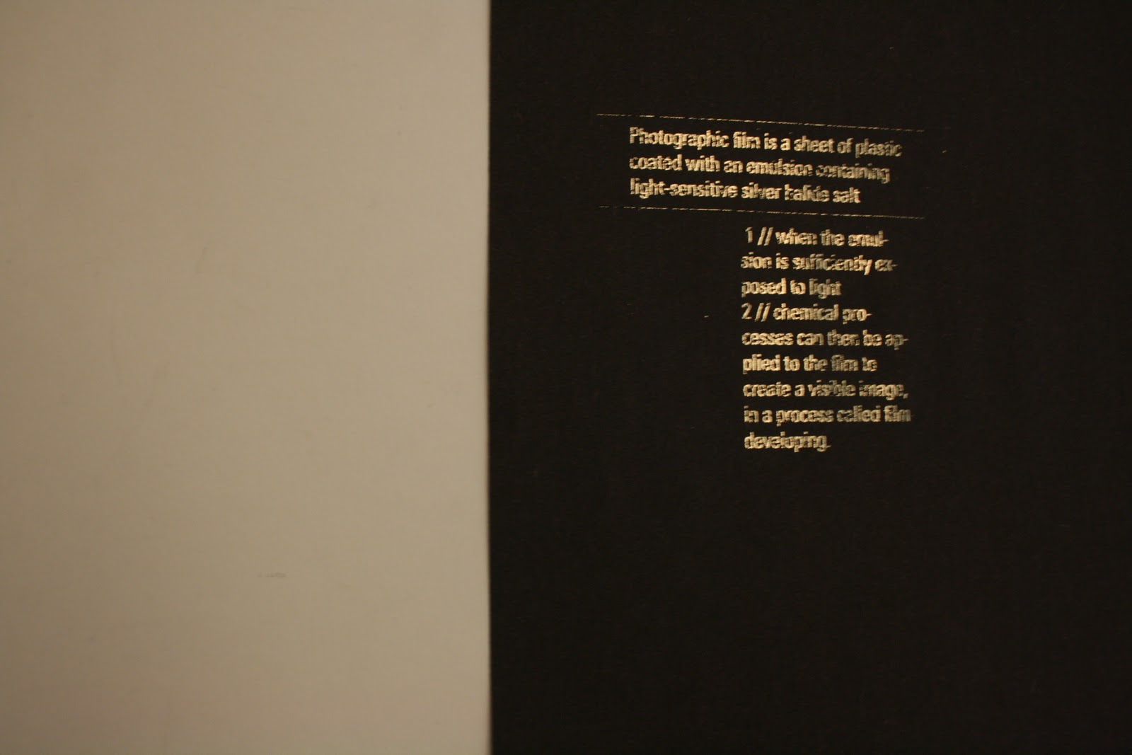
< I'm happy with how the design looks on satin stock. I'd be curious to see how some of the other poster designs would look like on maybe a gloss stock or with a foil finish

Thursday, 17 November 2011

PRINT//designs

final products for digital print:


additions to the deliverables..

business card:


notes for each frame on the film:


PACKAGING//final label designs

Looking over my designs made me re-think the application of colour in the labels as I wanted it to keep to that minimal looking design.


<< changing the aperture from fill to stroke


^^I'm alot more happy with how these are looking.


finishes//considerations
these packaging designs could be embossed for that sophistication OR foiled as it fits in with the silver salts that photographic film is made up of aswell as creating a more expensive looking finish.....


FOILING

foiling using the laminator in the library:


POSTER//development & final design


<< I dont feel this design is bold enough but it helped me develop onto the designs below which I think are appropriate to the brief...


although i like these designs they potentially have too much white space if they were to be placed with the other products which already have a fair bit of white space..


<< simple, bold & pretty effective


^^ I really like these posters as a trio, all three colours compliment eachother.


I decided this poster worked the best as the colours fit in nicely next to the products and the colours sit complimentary next to eachother on the poster itsef...

FINAL POSTER DESIGN:


LABELS//design development


< (too much colour//over powers the text)
the type isn't clear enough in order to communicate what the product actually is


<<< I liked the appearance of the stickers more then the actual application of them so I'm going to use the type layout from the sticker designs for the label, making it more clear as to what the products are...


Im a lot happier with how the labels are looking with colour and a more structural type layout (although I will continue to play around with the designs...)

Colour..

playing with this aperture-like design for colour on the designs...


POSTER:

Playing around with the logo and these designs have given me ideas for possible promotional poster designs...

I like how these are looking so I'll definitely look into how these could work for the poster