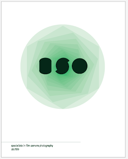
<< I dont feel this design is bold enough but it helped me develop onto the designs below which I think are appropriate to the brief...
although i like these designs they potentially have too much white space if they were to be placed with the other products which already have a fair bit of white space..
<< simple, bold & pretty effective
^^ I really like these posters as a trio, all three colours compliment eachother.
I decided this poster worked the best as the colours fit in nicely next to the products and the colours sit complimentary next to eachother on the poster itsef...
FINAL POSTER DESIGN:


