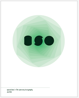
My two words from the randomizer:
SPIN + DISPERSE
the task set was to take each word and find:
20 words that relate to the chosen word
20 meanings
20 related objects
20 appropriate typefaces
SPIN
WORDS
/ rotate
/ twist
/ spin
/ whirl
/ dizzy
/ revolve
/ dancing
/ circuit
/ roll
/ turn
/ spiral
/ twine
/ shift
/ bias
/ confusion
/ swing
/ invent
/ ride
/ orbit
/ axis
/ propel
/ skip
/ blades
MEANING
/ cause to turn around rapidly, on an axis
/ sensation of dizziness
/ slang for a lie that has been legitimized
/ a motion within dance
/ spinning motion given to a ball
/ a situation out of control
/ poi spinning, a type of juggle
/ slang for tobacco
/ make (yarn) by drawing out, twisting, and winding fibers
/ to play a record
/ form into thread
/ a downward movement or trend
/ to move rapidly
/ spin of a wheel
/ sufi spinning
/ slang for 'it's been'
/ a particular viewpoint/bias
/ to go for a spin in the car
/ to shape into a form
/ to prolong
/ to fish with a spinning bait
/ the fast revolving motion of an aircraft as it descends rapidly
/ a brief trip in a car for pleasure
/ breakdance move
/ a stationary bike
/ a state of confusion
/ the art of scratching
SITUATIONS
/ all stars, planets & galaxies spin on an axis
/ to take the car out for a spin
/ his head was spinning
/ spinning records on the radio
/ the ball spun round
/ helicopter blades spin at high speeds
/ electrons spin around the nucleas
/ the room was spinning
/ an ice skater performs a skating spin
/ the spider span a web
/ SPIN magazine is sold in shops
/ the optical illusion appears to be spinning
/ a columnist may add a bias spin to the article
/ 'spin a while'
/ whilst doing a pirouette a dancer will spin
/ bait spins in order to catch a fishes attention
/ spin for a cigarette
/ there was a happy spin to the film
/ the patterns spun
/ the situation is spinning out of control
OBJECTS
/ bicycle wheel
/ planets
/ kaleidoscope
/ vinyl
/ whirlpool
/ optical illusion
/ spinner
/ spinning top
/ breakdancer
/ galaxy
/ helicopter
/ compass
/ car rim spinner
/ poi spinner
/ material/skirt
/ spider web
/ SPIN (magazine)
/ merry-go-round
/ light
/ atoms
/ stars
/ head
/ london eye
images:
TYPEFACES:
DISPERSE
WORDS
/ scatter
/ distribute
/ unbind
/ disjoin
/ separate
/ loosen
/ diffuse
/ spread
/ divert
/ split
/ veer
/ thin
/ move
/ disband
/ melt
/ disappear
/ radiate
/ dissolve
/ evaporate
/ diffract
MEANING
/ drive or send off in a direction
/ spread widely
/ cause to vanish
/ making particles separate
/ be scattered out of sight
/ cause to thin out and eventually disappear
/ divide into different wavelengths (light)
/ move away from eachother
/ dispersal is the act of organisms moving from one habitat to another
SITUATION
/ the clouds dispersed
/ police use tear gas to disperse a crowd
/ the city was empty; everyone had dispersed
/ salad dressing dispersed over the lettuce
/ the water dispersed the concentrate
/ the light entered the prism and dispersed into colours
/ pollon disperses in order to reproduce
/ red dye dispersed into the blue dye creating purple
/ the bag broke and the apples dispersed all over the floor
/ bubbles dispersed and disappeared into the sky
/ the smell of cooking disperses around the house
/ the cake was evenly dispersed
/ the young wolves left their pack to start a new one
/ the wind dispersed the fog
/ to disperse knowledge
/ the smoke dispersed into the sky

