Again, really soft piece of music; I want to keep it gentle to fit in with space. I like this song in terms of combining it with image so it's an option..
Tuesday, 31 January 2012
afterglow
Really gentle, ambient song. The sound of this song would be really good to work with in terms of visually syncing the sound with image. The vocals use words like 'elements' and 'time' which is also pretty appropriate.
Sunday, 29 January 2012
Wednesday, 25 January 2012
Tuesday, 24 January 2012
sound sync
After progressing with the title sequence I decided it's time to add sound as we've been told it's something that we're going to want to get on top of. Although it's quite fiddly, to find the key points in which you want to sync the music to the video, I actually really enjoyed the process. Sound definitely makes a huge impact with the final video, making it look a lot more professional and crisp.
working with the waveforms and keyframes...
Monday, 23 January 2012
progress
background opacity gradully increases
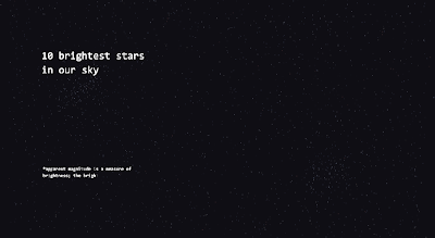
using the typewriter effect to reveal the type gradually.. appears informative.
this paint/fill effect allows the line to be revealed. very helpful for the constellation...
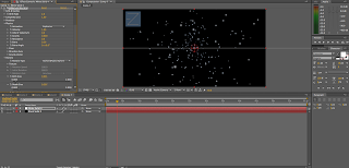
cc particle ^
i've increased the glow in order to dramatise the brightness of the star
type made smaller (still legible) as the text appeared too large and it actually took the empahsis off the imagery...
Sunday, 22 January 2012
gradient
I've been playing around gradients for the opening to the video so that it goes from sunset/evening up through the atmosphere and into space.
These are the two I couldn't decide on, however, the second gradient sat a lot nicer in the animation as the colours are more appropriate and i feel it communicates the concept better.
<< sits in with the video a lot more realistically.
These are the two I couldn't decide on, however, the second gradient sat a lot nicer in the animation as the colours are more appropriate and i feel it communicates the concept better.
<< sits in with the video a lot more realistically.
Saturday, 21 January 2012
Friday, 20 January 2012
anchor point
Keeping the anchor point the same with all layers i wanted to represent ways of spinning through the x, y and z axis. Originally i had the text in fill but i found stroke works a lot better with legibility and effect.
all three axis rotations have different quantities. ie the y rotated twice, z once etc to mix up the visuals.
Subscribe to:
Comments (Atom)


