All my idents were kept quite simplistic as I felt it was appropriate for the title sequence content. They all contain clear, delicate shapes and sync to the music. I also wanted to use a range of parts in the song as I could do something different with each sound effect.
Showing posts with label top10. Show all posts
Showing posts with label top10. Show all posts
Monday, 6 February 2012
Sunday, 5 February 2012
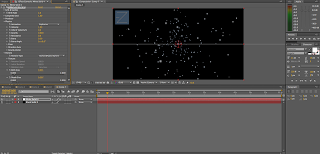
final title sequence
Finally have a completed title sequence. I got really into syncing the music with the anaimation. The chosen song fits in really nicely with the content and helped in terms of creativity as the noises that played inspired me to create new effects. I tried to play with depth within this video using: a 3D-like sun, a detailed background, cc particle world, movement through the x, y & z axis etc and for the universe, it fitted in nicely, however, this could all be improved with time. I wanted to keep the type quite minimal and small as i felt it took the emphasis off the imagery which i wanted to keep clear and simple. The circular movements seem to compliment the sound which is nice. All in all it's been really interesting to learn a skill in a different area of graphic design and I feel pretty comfortable using the software.
Thursday, 2 February 2012


Wednesday, 1 February 2012
sound
This song works really well with my concept. The first 60 seconds are the noises that I was looking for in order to fit in nicely with an animation on stars as they're light/simple. The fact that there isn't much going on works effectively with the silence of space.
Tuesday, 31 January 2012
smooth skin
Again, really soft piece of music; I want to keep it gentle to fit in with space. I like this song in terms of combining it with image so it's an option..
afterglow
Really gentle, ambient song. The sound of this song would be really good to work with in terms of visually syncing the sound with image. The vocals use words like 'elements' and 'time' which is also pretty appropriate.
Wednesday, 25 January 2012
cc particle
Using an online tutorial, I was able to create the illusion of moving through space. It took a bit of tweeking but I'm happy with the results as they create depth and movement really nicely.


Tuesday, 24 January 2012
sound sync
After progressing with the title sequence I decided it's time to add sound as we've been told it's something that we're going to want to get on top of. Although it's quite fiddly, to find the key points in which you want to sync the music to the video, I actually really enjoyed the process. Sound definitely makes a huge impact with the final video, making it look a lot more professional and crisp.
working with the waveforms and keyframes...
Monday, 23 January 2012
progress


background opacity gradully increases

using the typewriter effect to reveal the type gradually.. appears informative.


this paint/fill effect allows the line to be revealed. very helpful for the constellation...


cc particle ^


i've increased the glow in order to dramatise the brightness of the star


type made smaller (still legible) as the text appeared too large and it actually took the empahsis off the imagery...


Sunday, 22 January 2012
gradient
I've been playing around gradients for the opening to the video so that it goes from sunset/evening up through the atmosphere and into space.
These are the two I couldn't decide on, however, the second gradient sat a lot nicer in the animation as the colours are more appropriate and i feel it communicates the concept better.


<< sits in with the video a lot more realistically.
These are the two I couldn't decide on, however, the second gradient sat a lot nicer in the animation as the colours are more appropriate and i feel it communicates the concept better.


<< sits in with the video a lot more realistically.
Saturday, 21 January 2012

Friday, 20 January 2012
crit feedback
I wanted to play around with the information that will be in the idents so i can start looking at composition. The tests were taken to the crit and we concluded the second ident layout makes for better readability.
brightest star ident1 from Frankie Roberts on Vimeo.
brightest star ident2 from Frankie Roberts on Vimeo.
brightest star ident1 from Frankie Roberts on Vimeo.
brightest star ident2 from Frankie Roberts on Vimeo.
Thursday, 19 January 2012
crit
After some helpful feedback at this weeks crit, I've decided to settle on Consolas for the chosen typeface. It appears informative and appropriate to my chosen content. Applying this typeface ontop of the background shows it worked in terms of context.


^ the action/title safe button has proved to be very useful for layout


^ the action/title safe button has proved to be very useful for layout
Friday, 13 January 2012
tests
Using storyboards i created this quick video of how the sun could come into frame. Although i took a while it's allowed me to get a bit more comfortable with the software...
Untitled from Frankie Roberts on Vimeo.
Wednesday, 11 January 2012
background
Basic background for the title sequence made up of a range of different sized stars... i wanted to try and make it appear quite realistic so took some time with composition and quantity. I also placed some subtle red and blue stars in their to create a sense of depth.


Tuesday, 10 January 2012
title sequence
Here I've experimented with how exactly the star would appear...


Originally i thought working in a 2-dimensional form would look appealing and allow clear crisp imagery. However, I then used a clipping mask to make a 3-dimensional looking sun. I'm kean on the idea of setting myself a challenge & so have decided to settle on the 3-dimensional sun which will set me up with the challenge of creating a three-dimensional like video on after effects...


 <<(with both selected)


Originally i thought working in a 2-dimensional form would look appealing and allow clear crisp imagery. However, I then used a clipping mask to make a 3-dimensional looking sun. I'm kean on the idea of setting myself a challenge & so have decided to settle on the 3-dimensional sun which will set me up with the challenge of creating a three-dimensional like video on after effects...


Subscribe to:
Comments (Atom)