Sunday, 28 November 2010

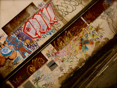
Collection of Leeds...

Images
Including wall art, road signs, posters, arrows as pieces of graphic design, aswell as litter, lights etc...


Some statistics:

Largest Cities in the UK

From the website http://www.ukcities.co.uk/populations/...

CityPopulation
London7.2 Million
Birmingham992000
Leeds720000
Glasgow560000
Sheffield512000
Bradford467000
Edinburgh450000
Liverpool440000
Manchester420000
Bristol380000
Wakefield316000
Cardiff310000
Coventry305000
Nottingham285000
Leicester280000
Sunderland280000
Belfast280000
Newcastle upon Tyne259000
Brighton248000
Hull240000
Plymouth240000


LEEDS COUNCILENGLISH AVERAGE
Population761,100-
Households335,000-
Burglary20.511.1
Criminal damage21.817.4
Drug offences3.84.5
Fraud and forgery2.33.1
Offences against vehicles15.111.1
Other offences1.81.3
Other theft offences23.620.0
Robbery1.91.6
Sexual offences0.91.0
Violence against the person16.416.8


From the website: http://www.upmystreet.com/local/crime-in-leeds.html


LEEDS - Related Words:

Lively
Fun
Inspiring
Energetic
Busy
Cold
Adventurous
Influential
People
Culture
Fashion
Design
Surprising
Guiding
Humanizing
Art
City
Active
Electricity
Living


Monday, 22 November 2010

Damage - 10 letters


Web definition for Damage:
               noun: injury or harm impairing the function or condition of a person or thing


From this: 


to this:


Illustrator Brief


FINAL DESIGN


Development work:


Sunday, 21 November 2010

End Of Module Self-Evaluation


1.  What skills have you developed through this module and how effectively do you think you have applied them?
Firstly, the illustrator tutorials have been really helpful due to the fact that I hadn't had much experience using it. Im now using illustrator with more confidence within the briefs. Secondly, the course has helped with my time keeping. Its slowly improving (I'm getting the hang of it!). Already Im getting better at evalutaing my own work, which has always been quite difficult. I'd say the crits have helped with this, as you begin to look at your work in a different way.

2. What approaches to/methods of research have you developed and how have they informed your design development process?
Since being on the course, I've used the library a lot of the time for my research. Seeing other designers work and ideas definately allows you to have a more informed and  greater understanding on the design development process. 

3. What strengths can you identify in your work and how have/will you capitalise on these?
I'd say one of my strengths would be that I tend to develop an idea quite soon in the development period, allowing me to develop towards a final piece. 

4. What weaknesses can you identify in your work and how will you address these more fully?
My first weakness would probably be with indecision, as in although I can develop an idea reasonably quickly, I tend to change my mind half way through. Which leads onto the second weakness of time keeping. I think I'll seek help from student advice, just to make sure I can stay on top of things!

5. Identify five things that you will do differently next time and what do you expect to gain from doing these?
1) Instead of jumping straight into things, I need to do more design sheets & sketchbook work. I tend to roll with something too soon, sometimes without noting what it is exactly that I plan to do.
2) Be more time efficient! This includes getting more work done earlier on so I can stay on top of my work. Just need that bit of clarity & order.
3)I could probably due with more designer research, simply because it broadens you're development & you gain a greater knowledge in the subject area.
4) Not get the flu! Getting the flu effected my beginning progress in the course, although I seem to be on top of my work now, it has effected my attendance level quite a bit so hopefully that can built up again!
5)General better management of time. It would really help to keep organised, meaning no problems with creating a final piece.

Attendance - 1/2 (due to circumstances)
Punctuality - 3/4
Motivation - 4
Commitment - 5
Quantity of work produced - 3
Quality of work produced - 3/4
Contribution to the group - 3/4


Visual Thinking - 16/11/10

Colour Theory Continued...

In this session, instead of looking at the individual colours, the focus was on the effect of combining two colours. This included complimentary colours, looking at the effect of the juxtoposition on the eye. 


Its evident that placing contrasting colours next to eachother enhances the vibrancy...

For example:
After placing the green hanger on the red background, it's clear that the combination has quite a dramatic visual difference compared to placing the green hanger on a more similar tone to the yellow background


^^^ Alot easier on the eye


Again, by contrasting the object to its complimentary colour, it tends to stand out more...


One last time!...


The same red paper:


Playing with three colours, keeping the central colour green in order to compare:


^^^ In my opinion, the central green appears most bold when placed next to the two warm colours of red & yellow..... again, its all about the contrast!


Thursday, 18 November 2010

No News Is Good News

"Produce a mailshot that distributes, disseminates and reinforces your message to an appropriate list of recipients"


Final envelope:


This cover design was chosen due to the fact that it relates back to the poster work, where the same pattern was used in order to portray the pores in the skin. The 'did you know' was added to prevoke curiosity as well as a femine touch seeing as that is the target audience.

The inside mailshot:


^ 2 facts & a rhetorical question...


Sticking with the original them throughout, giving the appearance of foundation which relates to the beauty advertisements.


Mailing List:


FEEDBACK:


DEVELOPMENT:


Experimenting:

Playing around with creating something that intrigues the audience into opening the mail shot, and finding out more.. 

Beginning to look at envelope formats


Inspired by "Your country needs YOU" .. 

Here, i used a magazine cover design in order to relate to the chosen audience..


Final outcome: